The High Low
Chart Editor
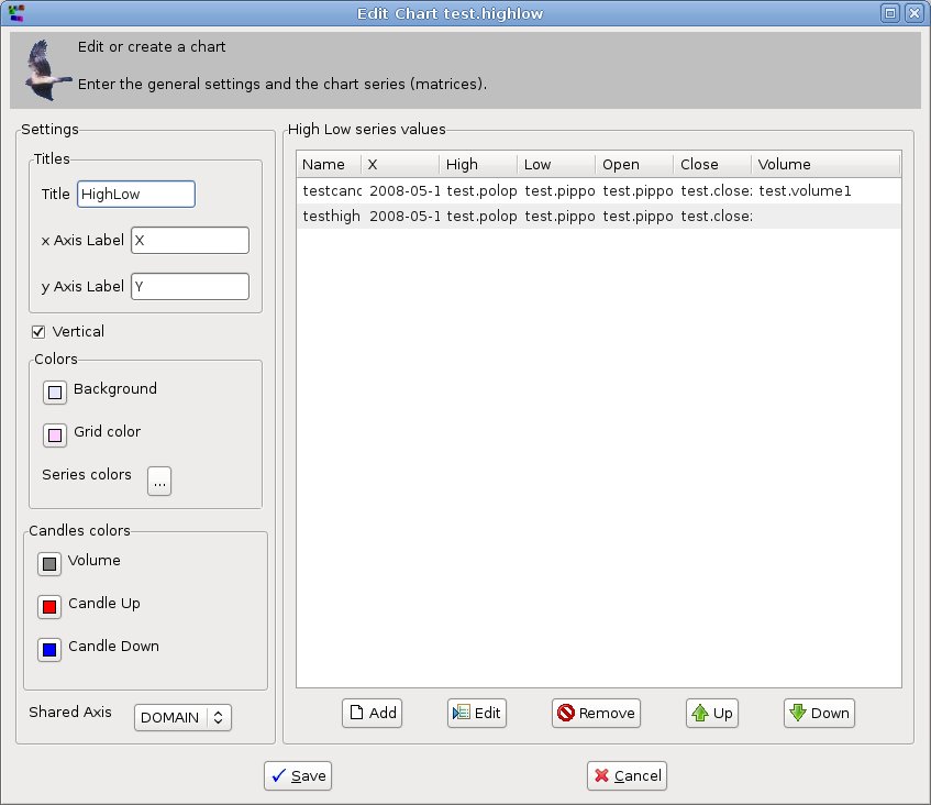
This is the editor for the high low chart:
High Low charts are used to show the change in time of prices and
volumes of financial
products.
Differently from the other charts, each series shows 4 or 5 values
(high, low, open, close, volume) for each point of the x axis.
This implementation allows to show 1 or more of such series.
When more series are displayed in one chart, they need to share either:
- the domain
axis (the time axis). In this case they are displayed one
under the other.
- the range
axis (the time axis). In this case they are displayed one
beside the other.
There are two types of this kind of chart:
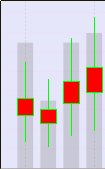
- candlestick,
in which the values are displayed in form of candles:
High is on the top of the line, low is on the bottom, open on the
bottom of the rectangle, close on the top. Volume is the
column in the background.
- highlow,
in which the values are displayed as interrupted lines:
High is on the top of the line, low is on the bottom, open on bottom
line interruption, close on the top line interruption.
The Settings Panel
In
the Settings panel
the Titles group of controls, the Vertical
check box and the Colors group of controls is
common to all
bar and line chart editors.
Let's give a beter look to this
panel:
In
the Titles group
of controls you can enter:
- the title
of the chart which, as seen for the pie chart, is on the top of the
chart
- the labels that describe
the x and y axes of the chart
If the Vertical
check box is checked that the x axis is horizontal and the y
axis is vertical.
The opposite happens if it is unchecked.
In the Colors
group of controls you can choose the colors for:
- the
background of the chart
- the
grid on the chart background (in the example xy
line
chart it is blue). If grid and background color are the same the grid
does not show.
- the color given
to the bar or the line of each series. You can
change the color of the series clicking
on the ... button, which opens the series
color dialog.
The Candles Colors
group of controls are used in the Candlestick
charts (not in the proper high low charts). They are the colors for:
- the volume
column, that is displayed as a bar chart back the candlesticks.
- the candle
when the price moved up
from open to close.
- the candle
when the price moved down
from open to close.
The Shared Axis
combo box is used to choose the axis
to share among the series if you have more than one. You
can choose the domain (x) or range (y) axis.
The
Values Panel
The Values panel
shows a list of the series displayed in the chart.
The list has the columns:
- Series
Name used to identify the series
in the chart legend
- X is the source for the values composing
the x time axis. It can be a 1-dimensional date matrix or an interval
(start + step).
- High is
the 1-dimensional numerical matrix used to populate the high values.
- Low is
the 1-dimensional numerical matrix used to populate the low
values.
- Open is
the 1-dimensional numerical matrix used to populate the open
values.
- Close is
the 1-dimensional numerical matrix used to populate the close
values.
- Volume is
the 1-dimensional numerical matrix used to populate the volume
values. The volume is
only available in the candlestick charts, not in the proper high low
charts.
The matrices that populate the High, Low, Open, Close and Volume series
must have the same size.
If the X axis source is a matrix, this must also have the same size.
The
series can be
added, updated, removed and moved up and down in the list (see the
buttons).
To
add a new series, you click on the Add button, which opens the
Add
High Low
Dialog.
Clicking
on the Update
button on the bottom of the
values list you can change the selected series always using the Add High Low dialog.


